Stationery Inspiration: Bright and Moody for Fall
In an effort to actively design more stationery suites in my free time, I’m excited to start a new blog series where I go through the inspiration and design process for a suite and reveal the final product mockup. For the first one, I wanted to lean into fall colors and warm tones, while also embracing pops of color that I might not normally choose. Keep reading through and comment below with your thoughts on the final suite and who might be the perfect bride for this creation!
The Initial Inspiration
My inspiration came from an interiors photo from Schumacher. I get so much invitation inspiration from interiors because they reflect so much of what stationery does; the use of color and pattern and texture is so important in both, and each one is a combination of many elements that have to serve purpose and function while looking cohesive while all together. I liked the way this room didn’t overuse pattern. The florals were able to stand out while pulling out other colors in the space, and the warm coffee-like wall color gave cozy and elegant vibes.
The Mood Board
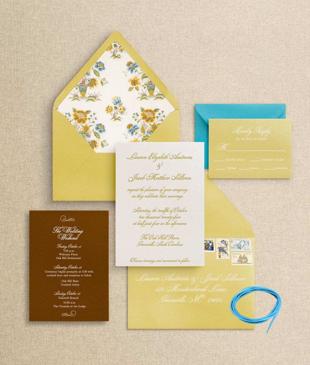
I started with looking for a floral pattern that resembled the space but wasn’t exactly what was used in the room. The pattern I found had brighter and less fall-like colors, meaning this suite could lend to several seasons, not just a fall wedding. From there, the chartreuse seemed an obvious choice for one of the paper options, so I found a beautiful chartreuse envelope (it’s very important when designing to choose colors that actually exist on the envelope market so I was thrilled to find this one!). The chestnut brown is a nod to the walls in the image, so I envisioned a details card and perhaps RSVP envelope pulling that base color into the design. Then, to combine all elements, a leather ribbon in either brown for an added rustic feel, or bright blue for a pop of color, connecting to the fabric, which would serve as the envelope liner.
The Final Result
The mockup came together so quickly after I created that mood board, and ultimately I chose a brighter RSVP envelope so the leather ribbon didn’t seem too random upon first opening the suite. I love the way the chartreuse looks in letterpress, and the color gives a fairly traditional suite a more modern feel for an event that will be both classic and guaranteed fun. If you know someone who would like a suite like this one, send them my way to bring it to life!


